How to put your logo in a QR code
After writing this post on somone hacking QR codes, Hack A Day commenters came out in full force posting some really cool links about modifying QR codes to include a logo. I’ll fully admit I geeked out a little, but in the process I figured out some of the theory behind embedding logos in QR codes.
After getting my hands on the ISO 18004 specification for QR codes, I decided to try embedding the Hack A Day skull & wrenches inside a QR code. The tools I used were Photoshop, this QR code generator, and Microsoft Paint (I’ve never seen a program to edit individual pixels that has a better UI, so don’t laugh).
For this ‘how-to,’ I’m going to walk through the process of modifying a Version 6 QR code. The Version 6 QR code is 41 pixels square, and is a very good balance between the amount of data that can be presented and the physical size of the code itself. The graphic below shows what is absolutely required of a Version 6 QR code standard. In practice, what is actually necessary is a little different, but I’ll just go with the specs for now.

Black in this graphic will always be black, white pixels in this graphic will always be white, red is a “keep out zone,” and gray is “don’t care.” The alternating black and white band on the top and left side of the QR code is the ‘timing pattern.’ This is the little bit that divides everything on the QR code into columns and rows. The gray part of this graphic is separated into 172 8-pixel zones, as shown below:
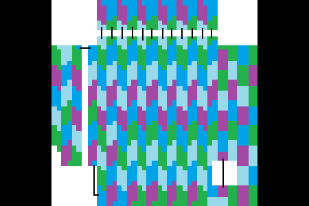
If anyone wants to 4-color map theorem this, I’ll gladly update it.
Some of these zones are non-contiguous, so I drew black lines connecting the corresponding parts. Each of these 8-pixel parts translate into one byte of data in an alphanumeric QR code. Now, the million dollar question: why is knowing how the bytes are arranged in a QR code important? The answer is with a high level of error correction, about 30% of these bytes can be complete gibberish, and your phone will still be able to read the QR code. with 172 areas, that means about 51 of them can be altered in any way, shape or form.
So, how do we implement this? First, we start out with a crappily-drawn Hack A Day logo:

It’s important to include both positive and negative space when designing this logo. If there wasn’t a white border going around the logo, the random black and white pixels would be placed right against the logo. Of course, I’m sure someone will come up with a great design that ignores this technique, but I’ll just do it this way for now. After overlaying the Hack A Day logo on top of the color map of the QR code, we get this:

Then we physically count the number of 8 pixel cells that are obscured by the logo. Since we’re doing a Version 6 QR code, about 51 of these cells can be covered up. It looks like this graphic is okay, so we move onto the next step: putting a real QR code in this thing.
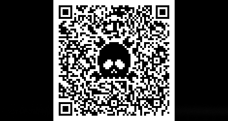
I used this site to generate all my QR codes for this post. It allows you to select the QR version number and the error correction level. After typing in “http://www.hackaday.com” as the code I want embedded, I ended up with this:
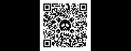
This little guy is going on our business cards.
That’s all well and good, but what if you want to put a logo in a QR code that a little bit larger than what would ‘normally’ be permitted? What if, for example, you wanted to tread into the timing area on the top and left side of a QR code? This is where design comes in. If a logo already has alternating black and white pixels, like the AT&T ‘Death Star’ for example, it’s fairly easy to have that logo overlap the timing pattern.
Yes, I used a Version 14 QR code for this, meaning it’s 73 pixels on a side. I did come up with smaller one, but it really doesn’t look as good.
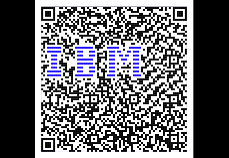
Notice the blue bars. QR code interpreters don’t care if a pixel is white, black, red, orange, or maroon - only contrast matters. Since the blue in Big Blue is fairly dark, it registers as a dark pixel. This can be exploited by adding both visual contrast and getting rid of the 1-pixel border that is required of a 1-bit graphic.
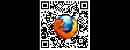
If the Firefox logo had a white border, the logo would cover more than 30% of the QR code. Putting in a full color graphic – especially one that defines itself from a background with a dark edge like an icon – gets around the need for a white border all the way around a logo. I’m sure there are more clever ways of toying with the palette of a logo, but I’ll let that go for another time.
But wait, there’s more. I’m not limited to the resolution of the QR code – I can overlay stuff at a higher resolution than the QR. This observation led me to this:
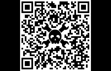
Yes, it works.
I’m hoping this how-to was at least a little helpful in demonstrating how logos can be put into QR codes. If you’ve got a neat example of this, leave a note in the comments or send it in on the tip line.
[참고] QR 코드 : 제작 사이트
http://www.racoindustries.com/barcodegenerator/2d/qr-code.aspx
[출처] hackaday.com
[주의] 본 자료는 연구용 및 학습 자료로 사용하길 바라며, 악의적인 사용시 사용자 본인에게 책임이 있음을 명시합니다.
'수술_도구 > 잡동사니(ETC)' 카테고리의 다른 글
| 버프 1.2 (2) | 2011.12.23 |
|---|---|
| Hosts 파일 변경 프로그램 (0) | 2011.10.07 |
